Dimond Lane
Keyword Ranking Project
Keyword Ranking Project
Project Overview
This was an internal interface redesign for a newly developed keyword ranking tool. The tool was designed to support media buyers in identifying high-performing keywords during peak traffic hours, streamlining content monetization decisions.
Objective / Challenge
The tool needed to serve two distinct user groups:
Advanced users (the CEO and a data analyst) who managed algorithmic inputs like p-values and required access to detailed data.
Media buyers (a team of 5–7 users) who needed a straightforward interface to guide their daily decisions, despite having little to no technical background.
One of the main challenges was that the development team had never worked with graph-based interfaces before. The backend team first needed to experiment and finalize basic data visualizations testing before any UI design could begin.
Process
I was brought in after the initial graphs were functional. My role focused on making the tool user-friendly, intuitive, and visually coherent. I worked closely with both user groups to ensure the interface was accessible to media buyers while maintaining the depth and flexibility required by advanced users.
Since the tech team was still refining the backend, we began without mockups. I collaborated with developers to understand the data and the visual constraints, then quickly iterated design solutions directly into the working product. I focused on clear layout structure, intuitive visual hierarchy, and reducing friction for non-technical users. For power users, I ensured access to deeper settings and controls remained seamless.
Final Outcome
The redesigned interface simplified navigation and dramatically improved the user experience for media buyers, enabling quicker keyword decisions and reducing confusion. For advanced users, the tool maintained robust control features. The tool became a regular part of the team’s workflow and improved efficiency across departments.
Keyword Display Card
Keyword Display Card
Click to View Previous Design
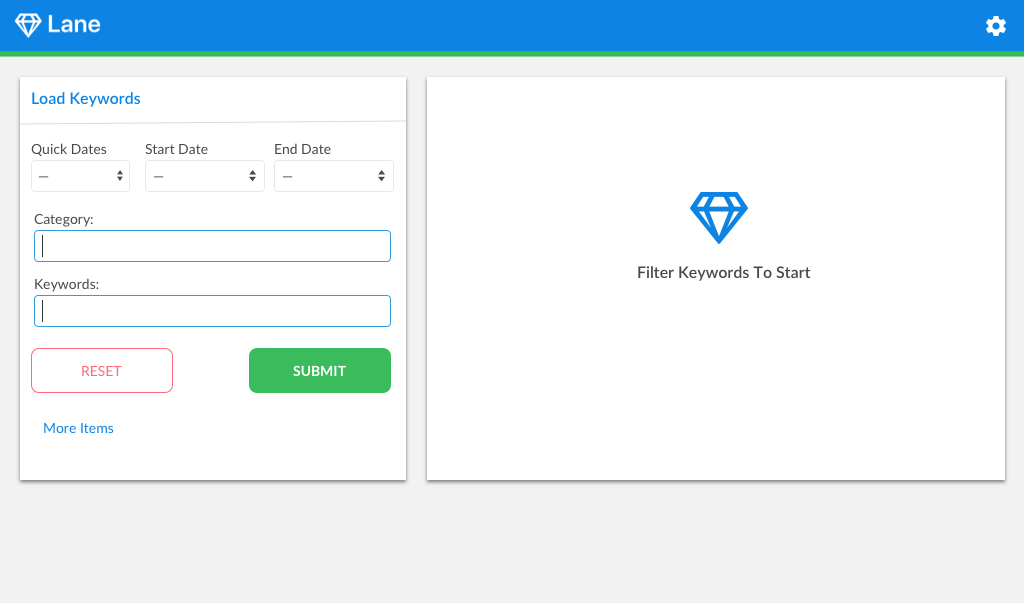
For this redesign, I added a results module on the right side that displays output after keyword input on the left. This change helps guide user expectations by making it clear where results will appear, unlike the previous version where the results section appeared only after submission, causing confusion.
I also repositioned the gear icon—used for advanced settings—further from the main interface to avoid distracting general users, as these features are primarily intended for advanced users.
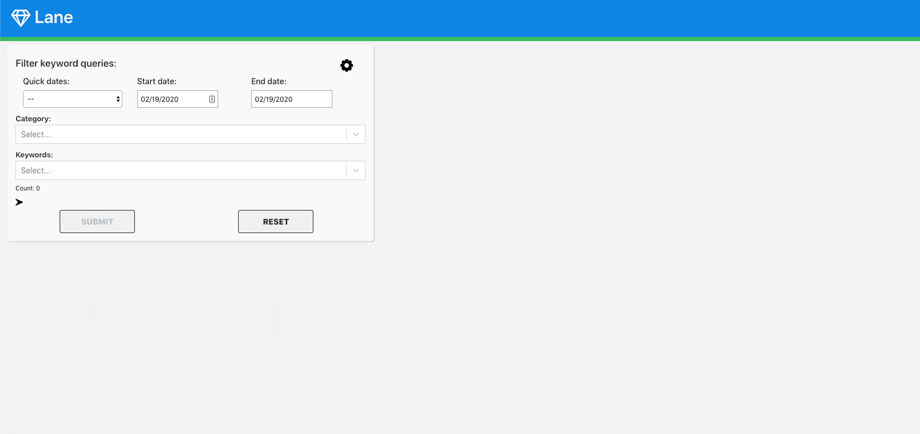
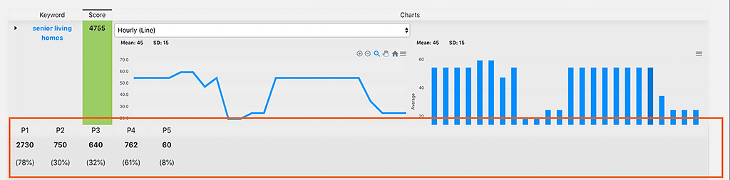
Loaded Terms
Loaded Terms
Click to View Previous Design
This comparison shows the previous design versus the updated interface after keyword results are loaded. Key design changes include improved color contrast between sections and the removal of three items beneath the keyword result box. These items were redundant for most users, as the same information is already clearly presented in the graphs.
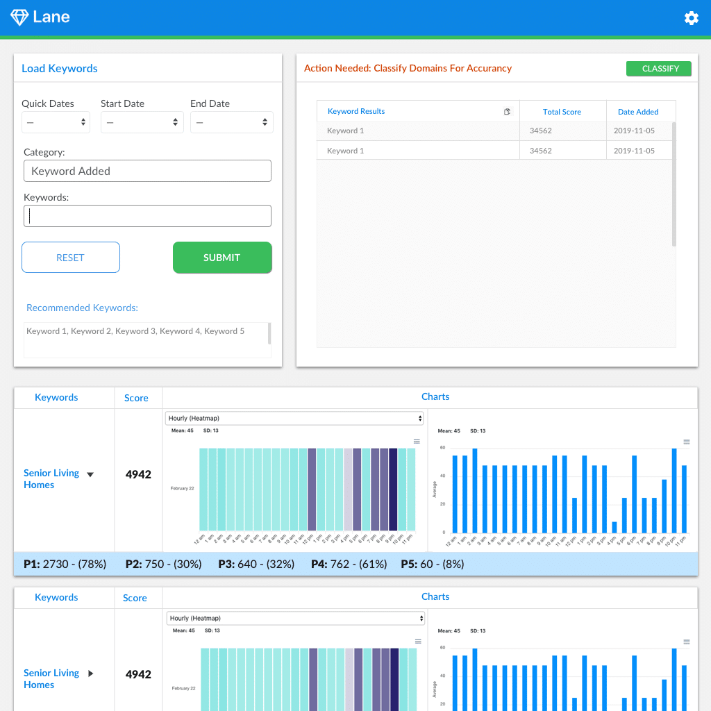
P Values
P Values
Click to View Previous Design
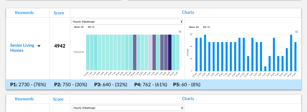
This card displays the p-values for each keyword. In the original design, p-values were shown by default for all keywords, but only advanced users understood their relevance. In my redesign, p-values are hidden by default and can be revealed by clicking the arrow next to each keyword.
I also switched to a horizontal layout to reduce vertical space usage. This allows more keyword cards to appear above the fold and encourages users to scroll through the content.
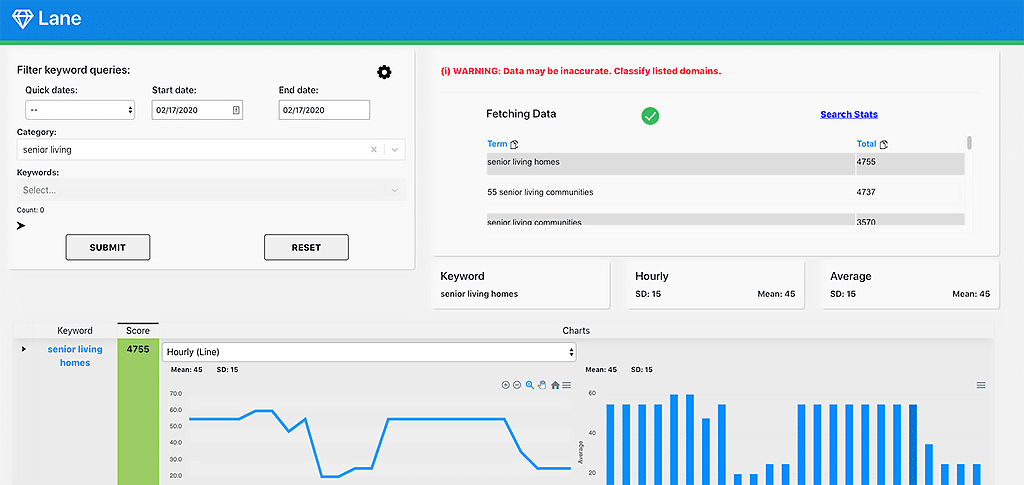
Adding Terms to Database & Changing P-Values
Adding Terms to Database & Changing P-Values
Click to View Previous Design
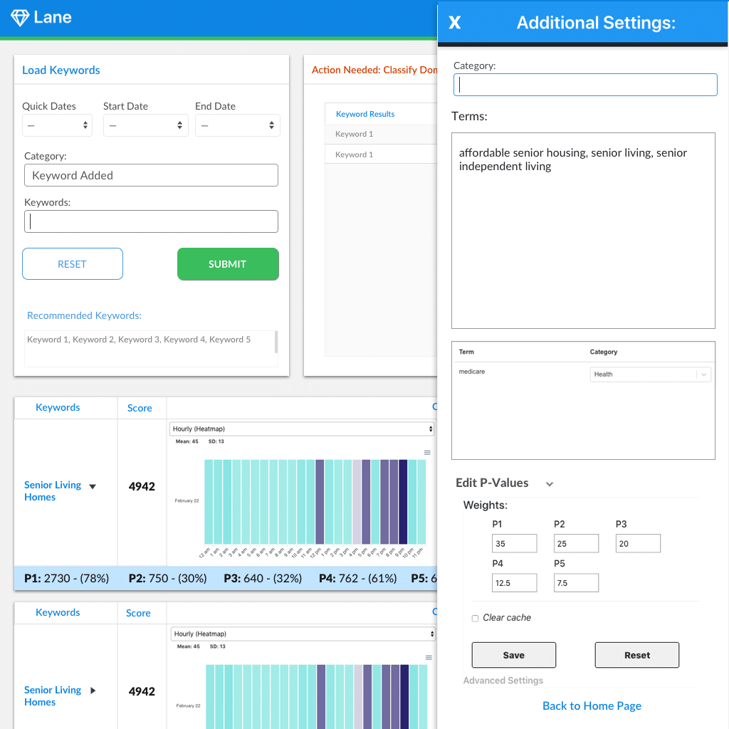
This side window controls the formula behind keyword weights and allows admin users to add new keywords to the database. Because these functions are intended for admin use only, I relocated the gear icon to the top right corner—keeping it accessible to admins while minimizing interaction for average users.
Note: P-value terms are only visible on each card when the user clicks the arrow next to the "Edit P-Values" text.