Dimond Lane (UI Redesign)
Keyword Ranking Project
Keyword Ranking Project
This was a simple interface redesign for a new keyword ranking tool that was developed for in-house use. This tool was developed as a way to help media buyers pick the right keywords at the highest demand hours.
Users:
Advanced users: CEO and a data analyst. They are the only ones that control the p values that control the algorithms, for the most part, they are tech-savvy.
Media Buyers: These users are a group of 5-7 individuals who are in charge of buying keywords and monetizing content. For the most part, they are not tech-savvy individuals.
For this project only, we began without mockups given that the tech department had never worked with graphs before and there was a lot of experimenting that they did before getting to a workable interface. But once they had the basic graphs running I was brought in to implement an interface design and usability.
Keyword Display Card
Keyword Display Card
Click to View Previous Design
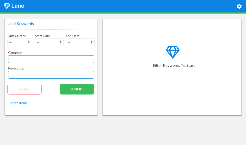
For this redesign, I added a module on the right that would display the results after the keyword input on the left. This was necessary because it gives the user instructions and an expectation of seeing something change in that section. Whereas the previous design only had the keyword input and once the results loaded the new section appeared.
Another addition was changing the gear icon further away from the main feature of the software since these features are only essential for advanced users.
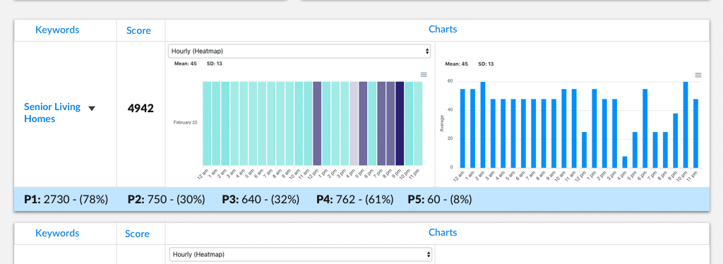
Loaded Terms
Loaded Terms
Click to View Previous Design
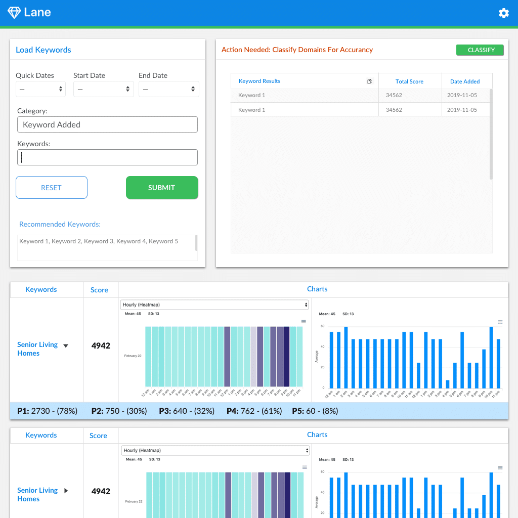
This is the comparison between the previous design and the redesigned screen once the terms are loaded. Design changes were the contrast of color between sections and removal of the three items underneath the keyword result box
since these results are not useful to the average user, in addition, this information is already displayed on the graphs.
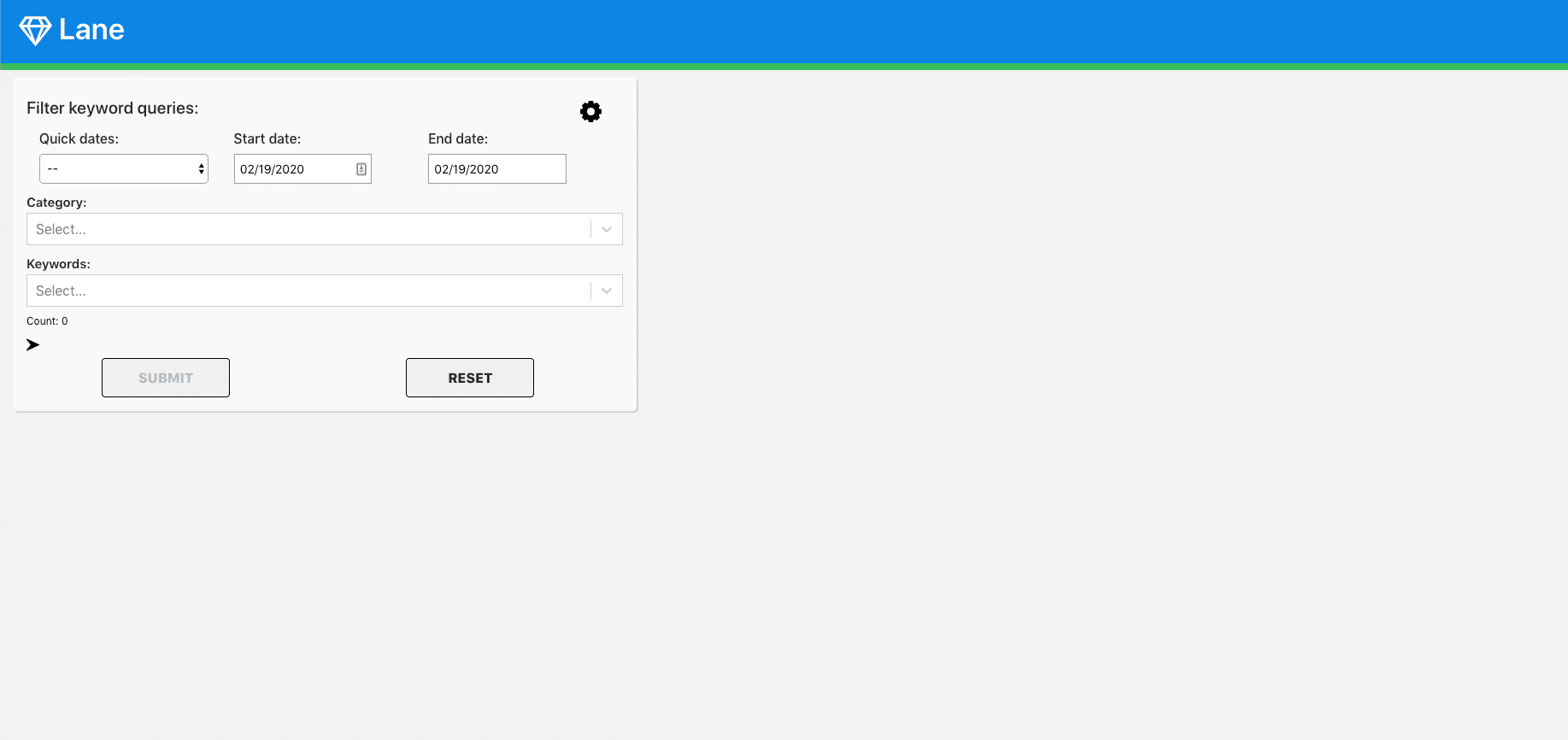
P Values
P Values
Click to View Previous Design
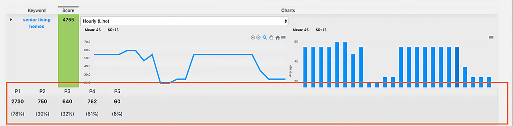
This card shows the p-values for each of the keywords, the first design has the p-values open for all keywords but only advanced users know what those are. Hence, for my redesign, I only made them available when clicking on the arrow next to the keyword.
I also used a horizontal display to reduce the vertical space so that keywords cards have more space above the fold and it encourages scroll.
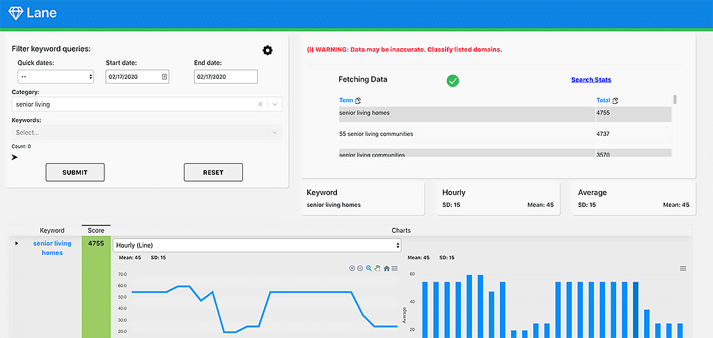
Adding Terms to Database & Changing P-Values
Adding Terms to Database & Changing P-Values
Click to View Previous Design
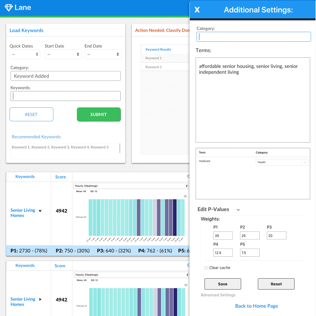
This side window controls the formula behind the keyword weights and adding new keywords to the database, which should be edited by admin users only. Which is why I moved the gear to the top right corner away from the average user usability, while it's still readily accessible for the admin user. Note: The P-Value terms are only visible on the card if the user clicks on the arrow next to the "Edit P-Values" text.